Day 5 Presentation!@!
  |
  |
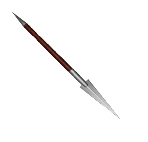
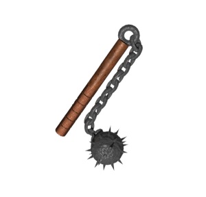
I messed around a bit trying different backgrounds and the like for my images but nothing seemed to be globally effective. So after some surfing the ol’ internet looking at ways to present my images, it just started to seem that a plain white background seems to work best in most cases. The white does not hide any features of the image and can possibly highlight certain things. I also wasted them to not be straight down in a line either. So after some time messing within the HTML side of WordPress i managed to size and get them all into a decent looking square. I also kind of liked them pointing into the center. They are still 4 separate images and clicking on them will enlarge them.
4 Comments
OH wow! These are done VERY well! I’m a big fan of the hammer! It has the most interesting design and most contrast =]
Love the Hammer, Fear the Hammer. By far i spent the most time on it and stylizing it. I also managed to get some runic text i made in Photoshop into the hilts on the shaft.
I thought you said from the beginning that you were going to have the weapons set in some sort of weapon stand…?
Yes that is true, but for the scope of the assignment it was not fitting as the assignment requires 4 different “panels”, and it will take a while to make another object and scene.